To begin with, building a great SaaS product with the right features and user experience is foundational to any SaaS brand’s survival and success.
But when it comes to converting prospects into customers, that’s not enough — having a great SaaS website design is equally essential, too. That’s because your SaaS company website is the pathway to sign-ups/demo requests and essentially serves as a preview of what the prospect can expect in terms of user experience.
At the same time, a well-designed website alone isn’t enough. To drive consistent traffic and conversions, pairing great design with high-quality content is key. Working with a SaaS content marketing agency can ensure your content strategy complements your website’s user experience, helping attract and nurture leads effectively.
To help you out, in this article, we’ll handpick and decode the top ten SaaS website designs that check all the right boxes of visual appeal, functionality, and conversions.
TL;DR
Your SaaS company website speaks volumes about the quality of your product and what prospects can expect, so ensuring an appealing design that builds confidence is pivotal.
Your website’s copy (tone of voice) and color scheme should reflect your brand’s unique value proposition.
The common theme we noticed in these top SaaS website designs was these elements: clutter-free and minimalist, easy to navigate, pleasant color combinations, good typography, mobile-friendly, and coherent flow.
1. Userpilot
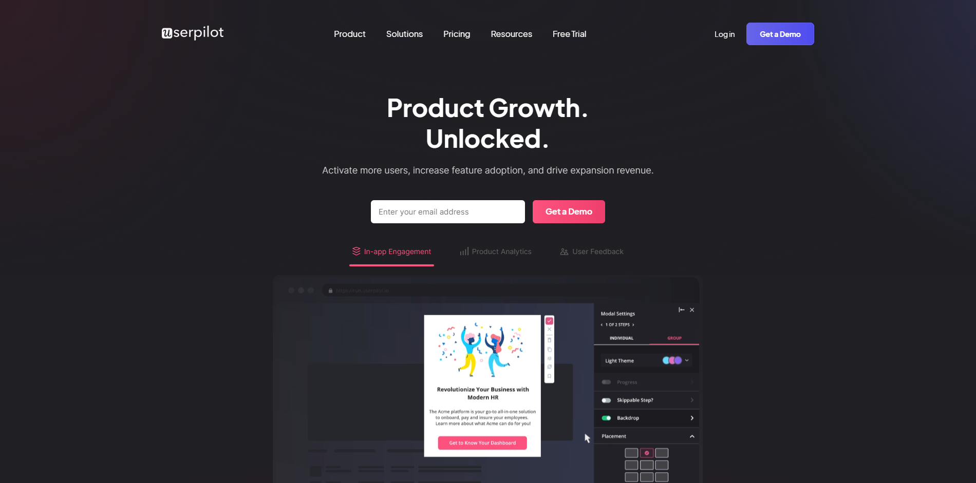
Userpilot is a user onboarding platform for SaaS companies, built to help them improve their user activation, adoption, expansion, and retention with personalized in-app experiences.
What’s great about Userpilot’s website design:
The headline “Unlock Growth Opportunities at Every Stage of the User Journey” crisply communicates Userpilot’s key value proposition. The hero illustration and color scheme aren’t shouty but rather subtle and inviting.
The website has a very clean design and color scheme, with a focus on simplicity and usability. The use of whitespace is effective, making the site feel uncluttered and easy to navigate.
The hero section is immediately followed by social proof with logos of their top customers, helping build instant confidence in their product’s value.
The description of its key solutions (activation, adoption, etc.) isn’t overwhelming, and the same easy-to-digest pattern is followed on its product pages.
There’s more social proof at the bottom of the homepage in the form of a customer testimonial followed by a clear CTA, reinforcing trust and encouraging the visitor to take action. On product pages, there are links to case studies, too.
Overall, the UserPilot website has a visually appealing and user-friendly design that effectively communicates the company’s key offerings and builds trust in its product, thus encouraging prospects to engage with the content and consider signing up for a trial or demo.
2. LiveChat
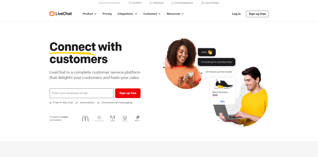
LiveChat is a customer support platform built to help brands big and small convert more website traffic into leads, personalize their website experiences, leverage AI-powered chatbot automation, and ultimately boost their sales.
What’s great about LiveChat’s website design:
The hero section is as good as it gets in terms of conveying the product’s key value proposition, building confidence in its effectiveness, and driving sign-ups. The simple video on the right demonstrating a chat powered by LiveChat, the neat mention of “Trusted by 37,000+ companies” with their logos, and the clear CTA all add up to a great first impression.
As you scroll down, you’ll find eye-catching illustrations and GIFs that convey the platform’s utility very well. The “Preview LiveChat on your home page with one click” option is sure to drive engagement.
Case studies, logos, customer tweets, success numbers, and team photos — the sheer abundance of social proof leaves no doubt about LiveChat’s credibility and authority as an industry-leading product.
On every page, the copy is concise and compelling. For example, on the Product Tour page, the headline says “It starts with chat. Then it just keeps getting better.”, followed by a one-liner “Take the LiveChat tour or dig right in with a free trial.” They also include statistics: “Customers love chatting because it’s quick, convenient, and simple. 51% of them prefer live chat over email and phone!” — making the message more convincing.
The Pricing page is crystal clear about what each plan offers, along with FAQs and 25/7/365 customer support for any assistance.
Overall, albeit a bit shouty with its color scheme, the LiveChat website does a good job of making you scroll and browse through its pages. It oozes an element of fun in the typically boring B2B segment, ultimately standing out from its competitors and driving visitor engagement.
3. Typeform
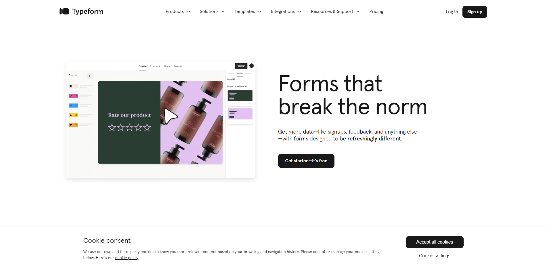
Typeform is an intuitive no-code form builder tool that allows you to create custom forms, surveys, and quizzes for various purposes like marketing, product feedback, client onboarding, HR, etc.
What’s great about Typeform’s website design:
The first thing you’ll note about its homepage is the utter simplicity and elegance of its design. The short looping video conveys precisely what the product is all about and the value it delivers. The CTA is simple and inviting. Brownie points for a headline that rhymes.
It is immediately followed by “Rated 4.5 out of 600+ reviews on G2.com and trusted by”, essentially following a best practice that all SaaS websites should follow — build instant confidence above the fold.
When you scroll further down, it’s more of looping videos coupled with easy-to-read copy in a minimal, white-space-rich design. Zero clutter. All the product pages follow suit.
The copy is conversational — for instance, “What survey questions to ask? It all depends on the type of survey you’re making…” or “Need a hand? Start with a template” — making it more engaging.
Overall, Typeform’s website is one of the best SaaS website designs out there right now that showcases the power of simplicity and minimalism.
4. DocuSign
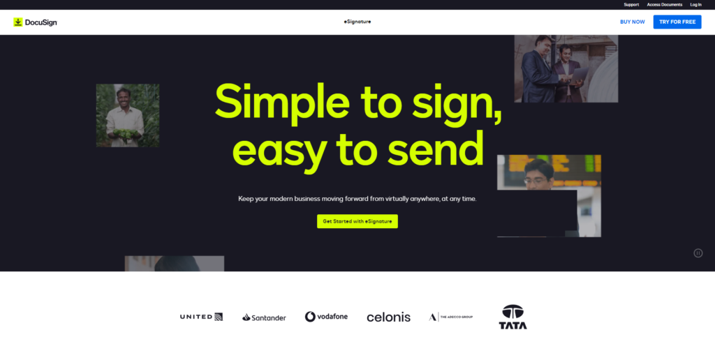
DocuSign is an e-signature platform designed for businesses and individuals to securely send and sign agreements from anywhere in the world.
What’s great about DocuSign’s website design:
One of the first things you’ll notice when you land on the website is the refreshing color scheme of blue and green. This choice of color combination invokes a sense of security, calm, and honesty about the company.
Each page on the website manages to convey a lot of information without looking messy.
It ticks all the boxes in terms of the use of pleasant visuals, whitespace, success numbers, customer logos, etc.
The Pricing page offers a comparison table to easily see what each plan offers, along with FAQs and trust-reinforcing logos of big brands using DocuSign.
Although the footer could benefit from some tidying up, overall, DocuSign’s website is a good example of B2B SaaS website design done well.
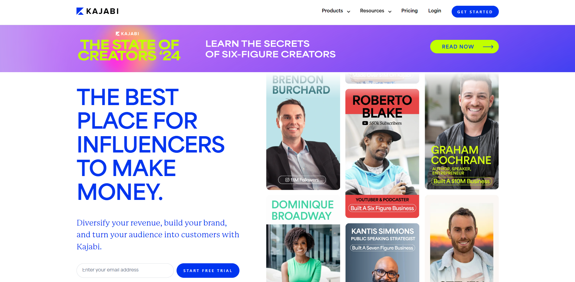
5. Kajabi
Kajabi is a knowledge commerce SaaS platform that empowers creators with the tools they need to package their knowledge into profitable online courses, coaching programs, podcasts, membership sites, and more.
What’s great about Kajabi’s website design:
The hero section instantly reflects Kajabi’s purpose i.e. to help creators make the most of their knowledge and expertise. The dynamic headline wherein the blue keyword “podcast”, “course”, “coaching”, etc. keeps changing along with the accompanying illustration of a successful creator helps achieve this.
The next section “Creators use Kajabi to do and earn more” showcases success numbers (such as “100K+ businesses built”) in bright and bold, relaying the same value proposition strongly.
The homepage includes an interactive tool that lets you calculate the estimated annual income generated from your knowledge-based product should you choose to sign up for Kajabi’s free trial, which is a great way to boost engagement and sign-ups.
After reaching a certain level of success, creators like to (and need to) think of themselves as business owners, and the website’s tone of voice reflects that. For example, the CTA reads “Since we’re both serious about your business, let’s make it official.”
The copy is seriously persuasive. For instance, “When you build on Kajabi, you’re joining 50,000+ serious experts, entrepreneurs and influencers around the world — you know, people like you.” or an H2 headline “Put your online course in their pocket” talking about Kajabi’s mobile app.
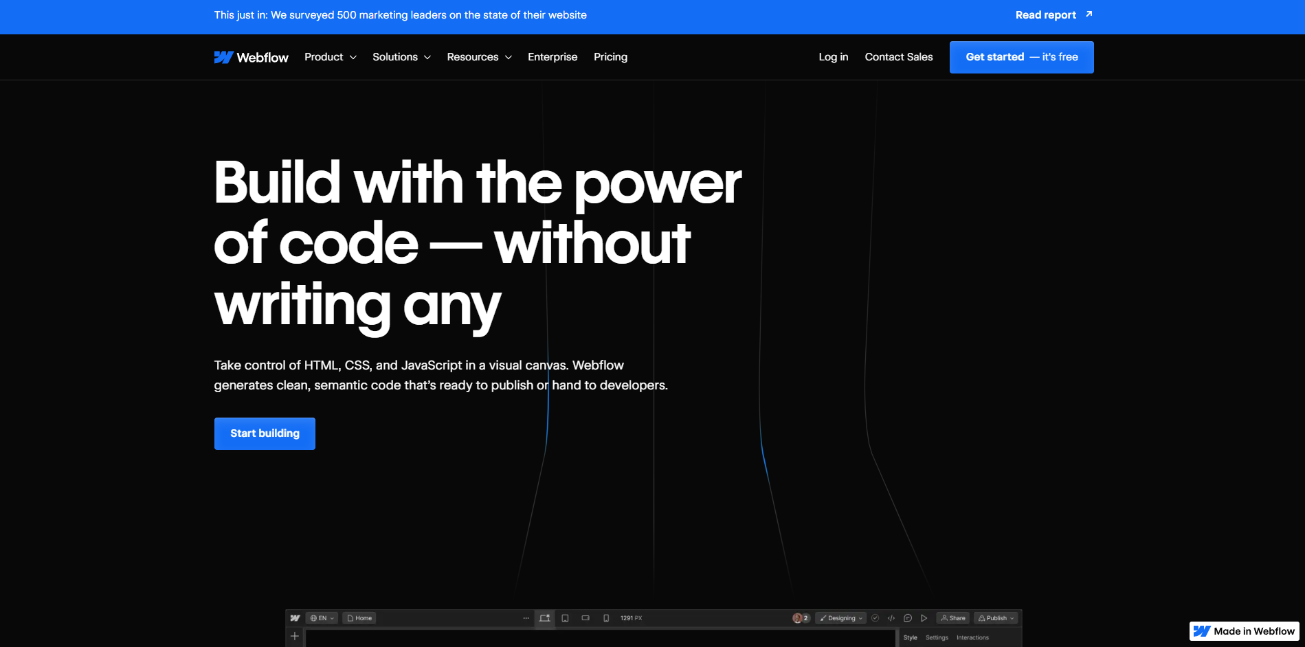
6. Webflow
Webflow is a no-code website builder that allows individuals and brands to build custom, professional websites in a visual drag-and-drop fashion.
What’s great about Webflow’s website design:
Building elaborate websites for commercial purposes has long been a weakness of website builder tools. For enterprise websites with complex functions and interfaces, some degree of coding is typically required, except if you opt for Webflow — and the bold headline relays that value proposition perfectly.
With an interesting combination of black typography on white background and white typography on dark background, the website is a joy to scroll through.
The looping videos do an excellent job of illustrating Webflow’s intuitive drag-and-drop interface and its key features. The benefits (such as “Build, launch, and update sites as quickly as your business moves, without hiring more devs.” and “Get the power of code without the cost of developers, managing infrastructure, or additional plug-ins.”) are neatly outlined, too.
As a business owner, when you see “Trusted by 200,000+ leading organizations” such as Dell, Rakuten, and Upwork, you know you’re in the right place if you’re looking for a professional website builder.
Each product page incorporates smooth scrolling animations and slick illustrations which hint at the amazing capabilities of Webflow as a website builder. The tone of voice for all pages is centered around the idea of creating impressive websites without code aka the no-code movement.
The “Made in Webflow” tag at the bottom right of every page reinforces the fact that anyone can make such outstanding websites if they sign up for Webflow.
Overall, Webflow’s website is true to its product — it does a brilliant job at conveying the platform’s capabilities and ease-of-use as a website builder, encouraging prospects to sign up and build a website just as good as Webflow’s for their own business.
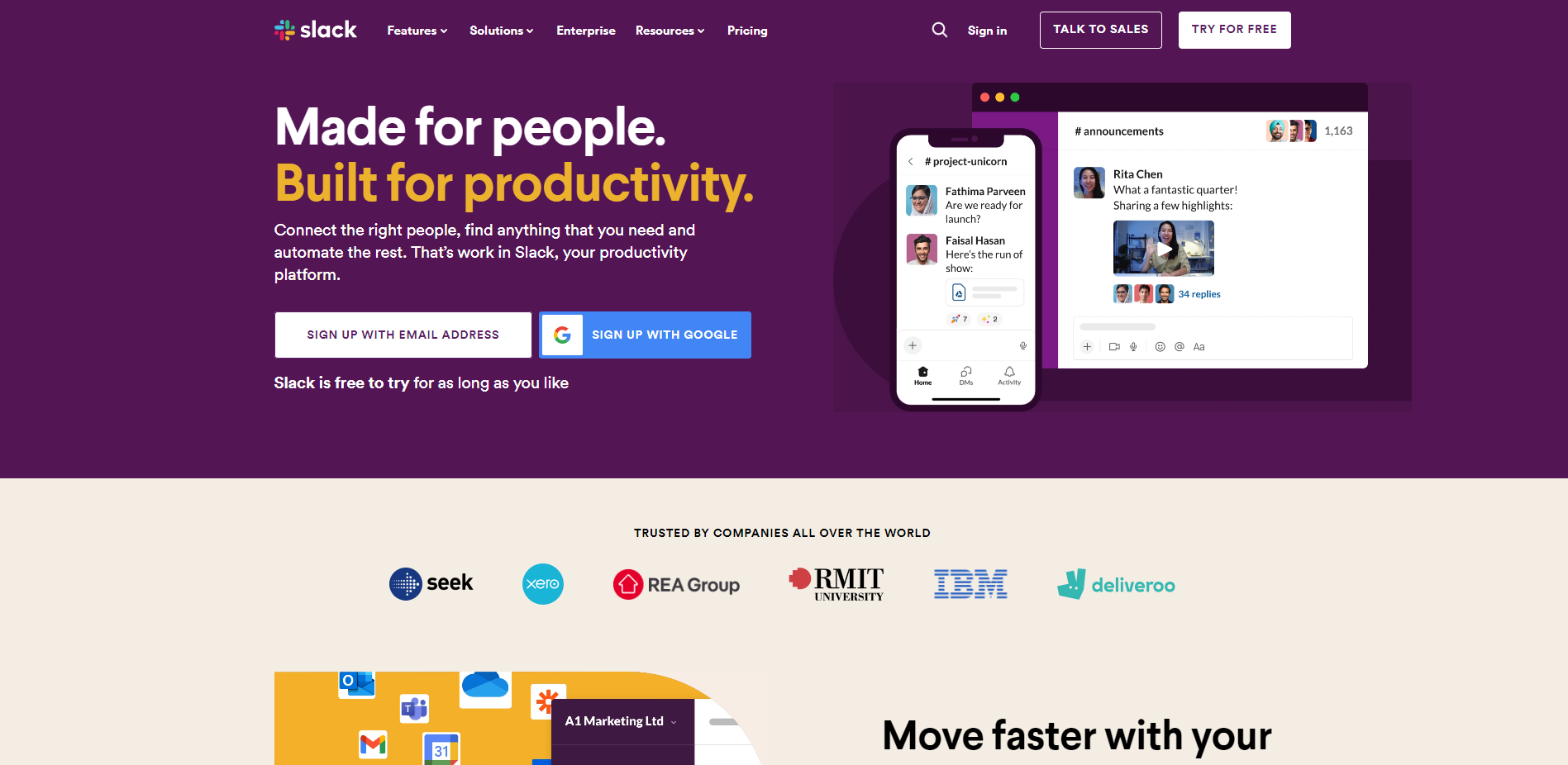
7. Slack
Slack — the popular workspace communication and productivity tool — really needs no introduction.
What’s great about Slack’s website design:
The design of all pages mirrors the app’s essence — fast and efficient communication — offering visitors an authentic experience.
With clean typography and concise messaging, it presents information in a digestible manner.
The homepage features quick looping videos that illustrate the key features and effortless onboarding.
With video-backed customer stories and survey-backed statistics (such as “85% of users say that Slack has improved communication”), there’s no shortage of social proof.
The features page is structured particularly well with its tile-based format and the pricing page is detailed enough to leave no doubts. Each page on the website comes with a set of FAQs.
The website also highlights the advantages of Slack over email, showcasing a thorough understanding of their competition.
Overall, Slack’s site is an exemplar of sublime B2B SaaS website design.
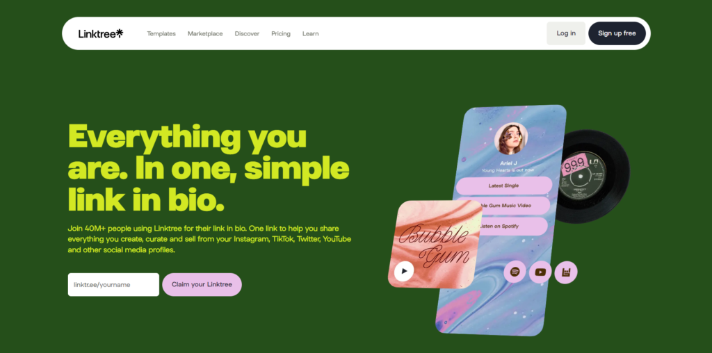
8. Linktree
Linktree is one of the most popular “link in bio” tools aimed at creators who wish to bring all their links (TikTok, Instagram, Twitter, website, etc.) into one easy-to-customize, good-looking, conversion-oriented landing page.
What’s great about Linktree’s website design:
Primarily targeting content creators and small businesses, Linktree’s website design is vibrant and visually powerful. It is a colorful expression that fully aligns with their product’s strategy and direction.
All the gorgeous illustrations are interactive when you hover or click on them. It makes for a fun user experience.
Brevity is at the heart of their copy — the feature descriptions are just enough to complement the illustrations and drive the message home.
Combined with all the other elements on the pages, the CTA textbox with the button “Claim your Linktree” is super inviting — it’d be hard for a budding creator to not enter their name and make their Linktree.
Overall, as a SaaS company website, Linktree truly stands out with a remarkably vivid design. From its platform-specific product pages to the Marketplace that showcases all its integrations, the website nails its messaging and color scheme keeping its audience at the forefront.
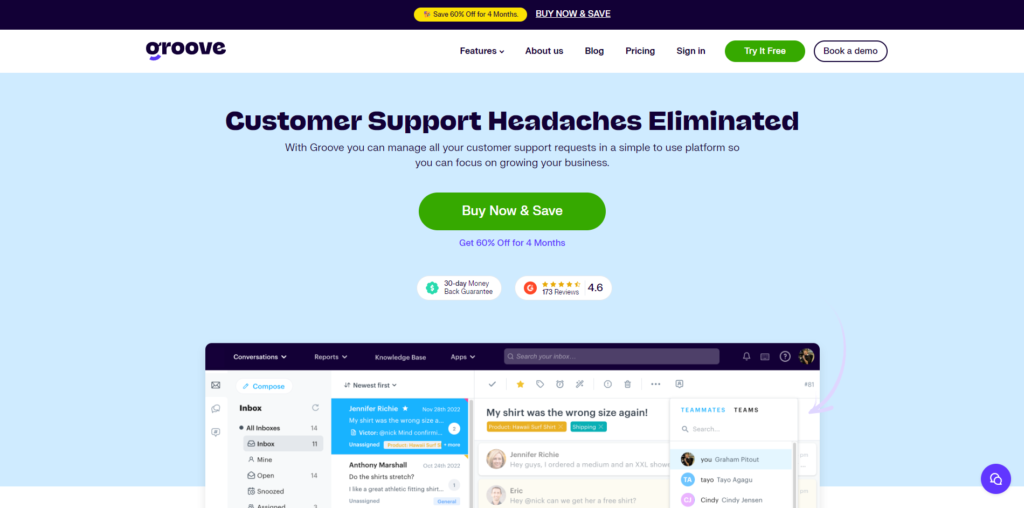
9. Groove
Groove is a helpdesk software solution that enables businesses to create a shared inbox, knowledge base, and live chat to better serve their customers and improve customer support.
What’s great about Groove’s website design:
To begin with, the headline “The simple yet powerful alternative to Zendesk.” is a bold one. They don’t beat around the bush in using their biggest competitor’s name to their advantage. Zendesk is a leader in the helpdesk software industry, but its biggest drawback as reported by users is its complexity — and Groove leverages that right in the hero section of their homepage with the 4.5-start G2 snapshot “A joy to use”.
The rest of the homepage follows all best practices — customer reviews and ratings, company logos, easy-to-read feature descriptions with beautiful illustrations, and a standout CTA section that alleviates any concerns (with phrases like “No credit card required” and “Cancel at anytime”).
The product pages (such as the Shared Inbox one) are brilliantly structured and solidify confidence in their offering with prominent G2 ratings and reviews along with customer testimonials.
The fonts, color palette, and overall aesthetics of the website truly hint at the premium quality you can expect from the product.
The CTA section “2,000 companies and 21,000 people build better customer experiences with Groove” coupled with well-known company logos and a bright “Start free trial” button is seriously compelling.
Overall, Groove’s website is another one that hits the bullseye with a pleasant UI and a buttery-smooth UX.
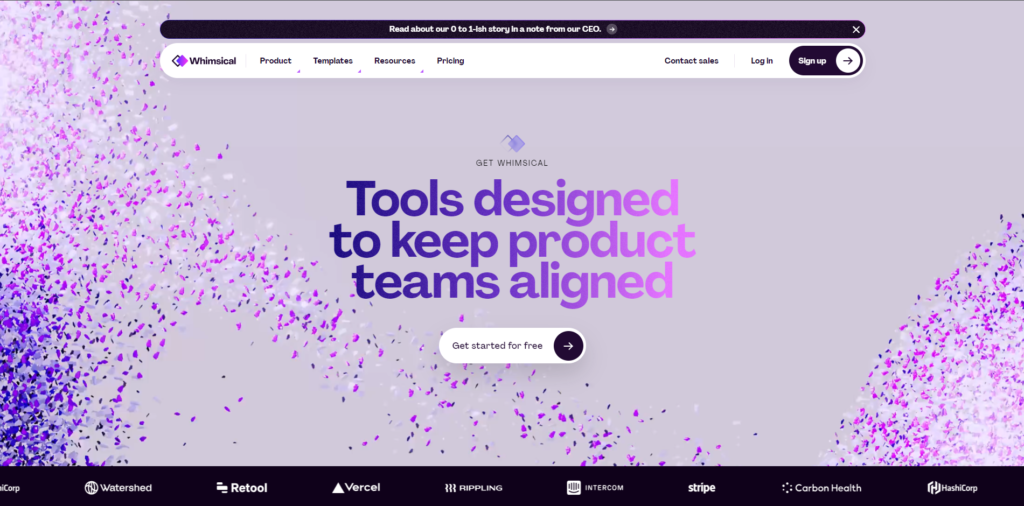
10. Whimsical
Whimsical is a visual collaboration tool that helps teams work together to create flowcharts, mind maps, wireframes, and documents. It centralizes whiteboards and docs into an all-in-one visual collaboration hub.
What’s great about Whimsical’s website design:
As soon as you land on the homepage, a short GIF in the hero section starts playing which elegantly presents the key value proposition of Whimsical. It creates a great first impression of the product, and for someone looking for a wireframing/flowcharting tool, the hero section is persuasive enough to click on the CTA right away to give the tool a spin.
The design is minimalistic yet rich — there isn’t a lot of copy — the illustrations do most of the talking, and do it impressively well (as they should for a visual collaboration platform).
The product pages follow suit — with product videos and illustrations in a simple, white-space-rich design and no clutter.
While the homepage lacks testimonials, a dedicated ‘Customers’ page makes up for it with plenty of customer reviews, social media shoutouts, G2 and Capterra ratings, and high-profile customer logos.
Overall, Whimsical’s website design is indeed a bit whimsical — playful in an appealing way. It’s true to its product offerings in terms of simple functionality and refinement.
Need Help With Website Design for Your SaaS?
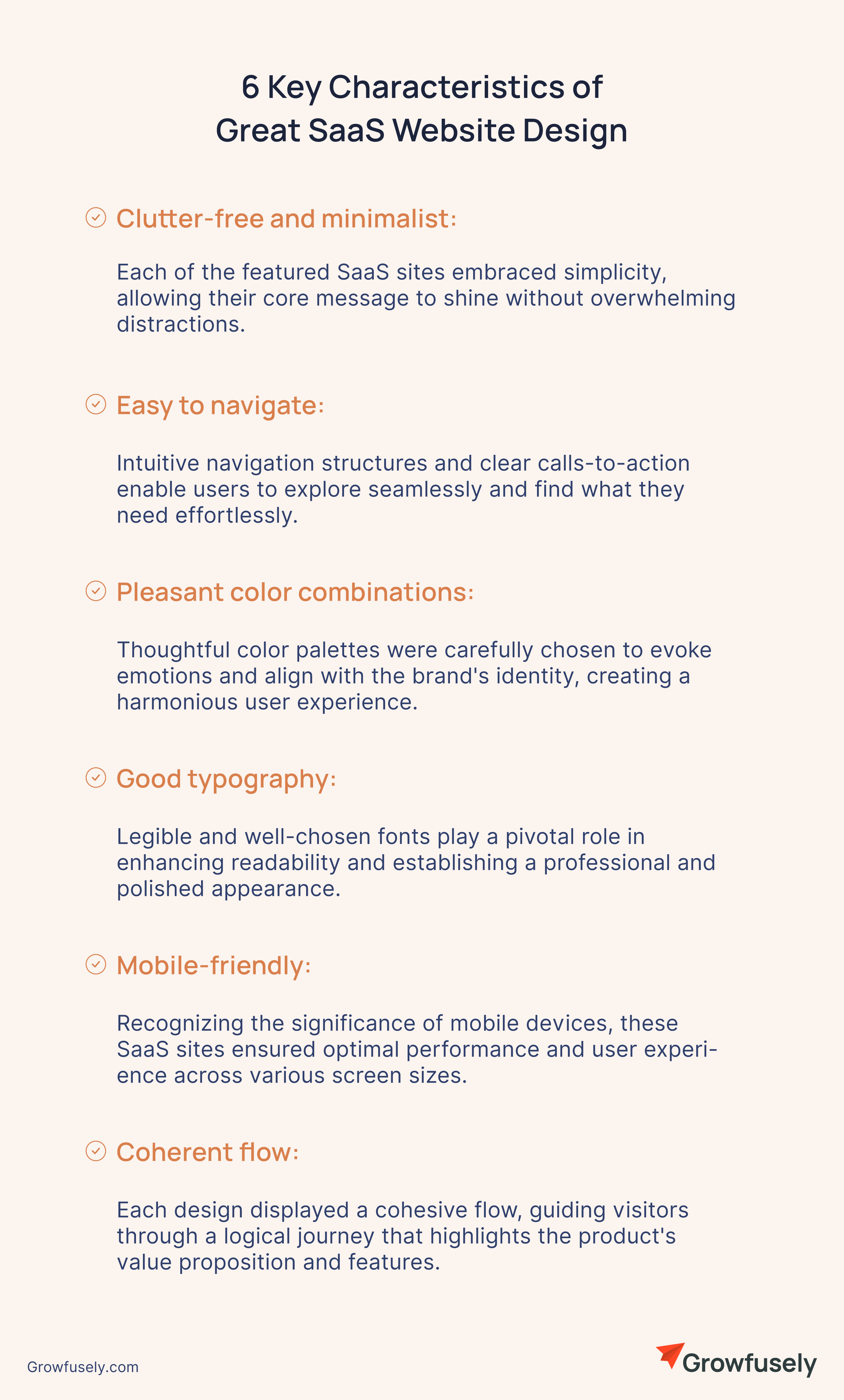
As we delved into decoding some of our favorite SaaS website designs, we observed a prevailing theme that sets these sites apart. They share the following elements, which contribute to their success in engaging visitors and conveying their brand message effectively:
Clutter-free and minimalist: Each of the featured SaaS sites embraced simplicity, allowing their core message to shine without overwhelming distractions.
Easy to navigate: Intuitive navigation structures and clear calls-to-action enable users to explore seamlessly and find what they need effortlessly.
Pleasant color combinations: Thoughtful color palettes were carefully chosen to evoke emotions and align with the brand’s identity, creating a harmonious user experience.
Good typography: Legible and well-chosen fonts play a pivotal role in enhancing readability and establishing a professional and polished appearance.
Mobile-friendly: Recognizing the significance of mobile devices, these SaaS sites ensured optimal performance and user experience across various screen sizes.
Coherent flow: Each design displayed a cohesive flow, guiding visitors through a logical journey that highlights the product’s value proposition and features.
Take a leaf out of their books to design (or redesign) your own SaaS website in a way that instills trust in your brand and ultimately drives conversions. Need help with that? Well, we’re not just critics, we do website design for SaaS companies. Get in touch with us to learn more about how our designers can help you craft an elegant, conversion-focused SaaS company website.

 About Growfusely
 White LabelMake us your (hidden) helping hand in delivering high-quality work to your SaaS clients.
 TeamCheck out the faces (and their backstories) behind our brand.
 Partner With UsJoin forces with us and earn a recurring monthly commission.
 Careers We're HiringJoin our growing team of passionate content marketing geeks.
 SEOBoost your search engine rankings with a blend of compelling content and technical tweaks.
 Content MarketingFuel your brand awareness and user acquisition with strategic content creation and distribution.
 Link BuildingEarn relevant, high-quality backlinks from top websites in and around your niche.
 Content WritingGet consistent, high-quality content that’s loved by users and search engines alike.
 Creative ServicesLeverage our seasoned designers to create custom-branded lead magnets, landing pages, infographics, and more.
 Digital PRSecure strong brand mentions and links on high-authority niche publications.
 SaaS InfographicsLearn battle-tested best practices on all things SaaS marketing — visually.
 SaaS InterviewsRead our tête-à-têtes with SaaS marketing experts on achieving content-driven organic growth.